SearchBar
A search bar component with leading and trailing icons, designed to handle user queries with search and clear actions.
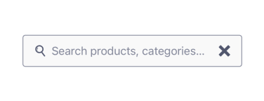
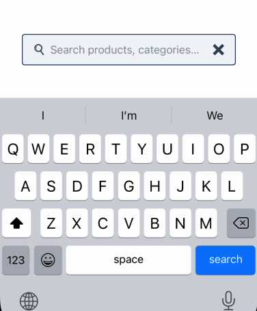
🔍 SearchBar Component
The SearchBar component provides an input field with an intuitive interface for searching. It includes a magnifying glass icon on the left and a clear button on the right. When the user submits the input (via keyboard), the onSearch callback is triggered. If the clear icon is tapped, the onClear callback is called. This component is built using the UILaunch design system and leverages the TextInputWithIcons molecule.
✨ Features
- Left icon (magnifying glass) and right icon (clear)
onSearchcallback triggers on submitonClearcallback triggers on icon press- Inherits all props from
TextInputatom - Fully styled via UILaunch design system
Notes
- This component assumes the presence of the
TextInputWithIconsmolecule from UILaunch. - The
onSearchcallback is only called if the input text is not empty after trimming. - You can customize the appearance or behavior further via the props inherited from
TextInput.
📦 Import
import SearchBar from '@madefordevs1999/ui-launch-native/system/organisms/SearchBar';🧩 Usage
import Box from '@madefordevs1999/ui-launch-native/system/atoms/Box';
import SearchBar from '@madefordevs1999/ui-launch-native/system/organisms/SearchBar';
import Spacing from '@madefordevs1999/ui-launch-native/system/theme/spacing';
import { Alert } from 'react-native';
import { useState } from 'react';

const Example = () => {
  const [query, setQuery] = useState('');

  const handleSearch = (text: string) => {
    console.log('Searching:', text);
    setQuery(text);
  };

  const handleClear = () => {
    console.log('Clearing search');
    setQuery('');
  };

  return (
    <Box flex={1} justifyContent="center" alignItems="center" padding={Spacing.Spacing4}>
      <SearchBar
        placeholder="Search..."
        onClear={() => Alert.alert('Clear', 'Search cleared')}
        onSearch={query =>
          Alert.alert('Search', `You searched for: ${query}`)
        }
      />
    </Box>
  );
};

export default Example;
📸 Results
📜 SearchBar Props
| Prop | Type | Default | Description |
|---|---|---|---|
onSearch | (text: string) => void | Promise<void> | required | Triggered when the user submits the search query |
onClear | () => void | Promise<void> | - | Triggered when the clear icon is pressed |
...rest | TextInputProps | - | Additional props inherited from the base TextInput component |