BubbleMessage
A message bubble component for chat interfaces, supporting optional avatar display, decorator tails, and action chips.
💬 BubbleMessage Component
The BubbleMessage component renders a stylized chat bubble suitable for messaging interfaces. It includes support for author avatars, dynamic message content, optional message actions (as chips), and message tail decorators to visually indicate the direction of the message. This component is styled using the UILaunch design system and built with foundational atoms and molecules like Box, Typography, and Chip.
✨ Features
- Displays text messages with support for action chips
- Supports optional avatar rendering for the message author
- Renders left or right tail decorator depending on sender (isOwnMessage)
- Tap handling via onPress for the whole message
- Fully styled via the UILaunch design system
Notes
- message.options allows rendering interactive chips (e.g., buttons with icons)
- The decorator (speech-bubble tail) is shown only when showDecorator is true
- Avatar is hidden when hideAuthor is
true - The layout adapts to screen width using breakpoints
📦 Import
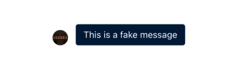
import BubbleMessage from '@madefordevs1999/ui-launch-native/system/organisms/BubbleMessage';🧩 Usage
import Box from '@madefordevs1999/ui-launch-native/system/atoms/Box';
import BubbleMessage from '@madefordevs1999/ui-launch-native/system/organisms/BubbleMessage';
import { Alert } from 'react-native';

const author = {
  id: '1',
  name: '<NAME>',
  avatar: 'https://avatars.githubusercontent.com/u/10731096?v=4',
};

const message = {
    options: [],
    text: 'This is a fake message',
    createdAt: new Date().toISOString(),
};

const Example = () => (
<Box padding={16}>
    <BubbleMessage
    author={author}
    message={message}
    isOwnMessage={false}
    showDecorator
    onPress={() => Alert.alert('Message tapped')}
    />
</Box>
);
📸 Result
📜 BubbleMessage Props
| Prop | Type | Default | Description |
|---|---|---|---|
author | MessageAuthor | required | The sender of the message, including name and avatar |
message | MessageBody | required | The message content and optional interactive options |
isOwnMessage | boolean | required | Determines message alignment and color scheme |
hideAuthor | boolean | false | Whether to hide the author's avatar |
onPress | () => void | Promise<void> | undefined | Callback triggered when the message bubble is tapped |
showDecorator | boolean | false | Whether to show a tail decorator (bubble tip) pointing to avatar side |