Tabs
📚 Tabs,component and component group
🧩 Component Group: Navigation / Tabs
A flexible tab-based navigation system for displaying categorized content. It includes a Tabs provider, interactive tab headers, and corresponding panels with smooth horizontal transitions.
🔍 Overview
The Tabs component suite provides a fully controlled, horizontally scrollable tab system with accessible state management via React Context. It enables navigation across content panels by selecting from a series of labeled tabs.
🔗 Component Structure
<Tabs defaultActiveTab="tab1" onTabChange={handleChange}>
  <TabHeaders>
    <TabHeader tabId="tab1" tabName="Home" />
    <TabHeader tabId="tab2" tabName="Settings" />
  </TabHeaders>
  <TabPanels>
    <TabPanel tabId="tab1">
      <HomeScreen />
    </TabPanel>
    <TabPanel tabId="tab2">
      <SettingsScreen />
    </TabPanel>
  </TabPanels>
</Tabs>
🔍 Components Breakdown
🔹 Tabs container
Provides context to child tab headers and panels, manages current activeTab and change propagation.
Tabs container Props:
| Name | Type | Default | Description |
|---|---|---|---|
defaultActiveTab | string | '' | Tab ID to be selected initially. |
onTabChange | (tabId: string) => void | - | Callback fired when active tab changes. |
🔹 TabHeader
Renders an interactive tab button.
TabHeader Props:
| Name | Type | Description |
|---|---|---|
tabId | string | Unique ID for tab selection. |
tabName | string | Display name shown in the tab header. |
startIcon | (isActive: boolean) => React.ReactElement | Optional icon shown before tab name. |
endIcon | (isActive: boolean) => React.ReactElement | Optional icon shown after tab name. |
💡 Uses Typography and Pressable for visual feedback and interactivity.
🔹 TabHeaders
Wrapper for rendering a horizontal scrollable list of TabHeader elements.
Behavior:
- Automatically scrollable if more than 3 tab headers.
- Responsive width allocation.
TabHeaders Props:
| Name | Type | Description |
|---|---|---|
children | React.ReactElement<TabHeaderProps>[] | Tab headers to display. |
🔹 TabPanels
Container that maps tabId from context to corresponding content panels and scrolls horizontally.
TabPanels Props:
| Name | Type | Description |
|---|---|---|
children | React.ReactElement<TabPanelProps>[] | Panels to show depending on active tab. |
Ref Methods (Imperative Handle):
Method Description scrollToPanelId(id) Scrolls to the tab panel with given ID.
🔹 TabPanel
Defines the content to show for a specific tab.
TabPanel Props:
| Name | Type | Description |
|---|---|---|
tabId | string | Identifier that maps to a TabHeader. |
children | React.ReactNode | Content rendered when this tab is active. |
⚠️ Each TabPanel must have a unique tabId.
✅ Usage Recommendations
- Keep tab IDs stable and unique.
- Limit the number of visible tabs to 3 or less to avoid unnecessary scrolling.
- Use TabPanelsHandle ref if you need to programmatically change the current tab.
- Icons in TabHeader can be used to convey tab state visually (e.g., filled vs outline).
⚠️ Known Limitations
- Assumes fixed height for headers and panels.
- Panel scroll animation is horizontal only.
- External state syncing is unidirectional via onTabChange.
- Avoid using nested Tabs and Scrolls components to prevent context conflicts.
🛠️ Example Usage
<Box flex={1} paddingTop={Spacing.Spacing8}>
<Tabs
defaultActiveTab="home"
onTabChange={tabId => console.log('Tab changed to:', tabId)}>
<TabHeaders>
<TabHeader tabId="home" tabName="Home" />
<TabHeader tabId="profile" tabName="Profile" />
<TabHeader tabId="settings" tabName="Settings" />
</TabHeaders>
<TabPanels>
<TabPanel tabId="home">
<Box
flex={1}
padding={Spacing.Spacing3}
backgroundColor={ColorChoices.LayerActive}>
<Typography.Heading>Welcome Home</Typography.Heading>
<Typography.Body>
This is the home tab content.
</Typography.Body>
</Box>
</TabPanel>
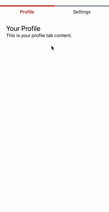
<TabPanel tabId="profile">
<Box padding={Spacing.Spacing3}>
<Typography.Heading>Your Profile</Typography.Heading>
<Typography.Body>
This is your profile tab content.
</Typography.Body>
</Box>
</TabPanel>
<TabPanel tabId="settings">
<Box padding={Spacing.Spacing3}>
<Typography.Heading>Settings</Typography.Heading>
<Typography.Body>
Here you can configure the app settings.
</Typography.Body>
</Box>
</TabPanel>
</TabPanels>
</Tabs>
</Box>Results