Switch
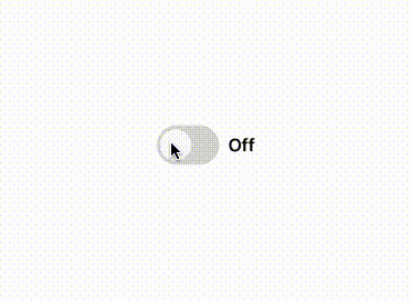
A toggle component from the UILaunch design system. Used to represent binary states such as on/off or enabled/disabled, with optional labels.
🕹️ Switch Component
The Switch component is used to toggle between two states (on/off). It supports animated transitions, disabled state, and optional labels for each state. Useful in settings, preferences, or binary input scenarios.

📦 Import
import Switch from '@madefordevs1999/ui-launch-native/system/molecules/Switch';🧩 Usage
import Switch from '@madefordevs1999/ui-launch-native/system/molecules/Switch';

const [isEnabled, setIsEnabled] = useState(false);

<Switch
  value={isEnabled}
  onValueChange={setIsEnabled}
  activeText="On"
  inactiveText="Off"
/>;
📸 Results
📜 Switch Props
| Prop Name | Type | Default | Description |
|---|---|---|---|
disabled | boolean | false | If true, the switch cannot be interacted with. |
value | boolean | — | Current value of the switch (controlled). |
initialValue | boolean | false | Initial value for the switch if value is not provided. |
onValueChange | (value: boolean) => void | — | Callback function when the switch is toggled. |
activeText | string | — | Text to display when the switch is active (checked). |
inactiveText | string | — | Text to display when the switch is inactive (unchecked). |