Tooltip
📌 Tooltip
A flexible tooltip component that shows contextual information when hovering or tapping on an element. It supports decorators, theming, and multiple placement options.
✅ When to use
Use Tooltip when you want to:
- Provide additional context or explanation without cluttering the UI.
- Display hints, labels, or helper text upon user interaction.
- Enhance accessibility and guide the user through your application.
🚫 When not to use
Avoid using Tooltip if:
- The content is critical and should always be visible (prefer inline text instead).
- You're targeting screen readers only (this is a visual-only tooltip).
- The interaction model is not hover/tap (e.g., persistent tooltips may require different UX).
Import
import Tooltip from '@madefordevs1999/ui-launch-native/system/atoms/Tooltip';🧩 Usage
import Box from '@madefordevs1999/ui-launch-native/system/atoms/Box';
import Typography from '@madefordevs1999/ui-launch-native/system/atoms/Typography';
import Spacing from '@madefordevs1999/ui-launch-native/system/theme/spacing';
import Tooltip from '@madefordevs1999/ui-launch-native/system/atoms/Tooltip';
import { Pressable } from 'react-native';
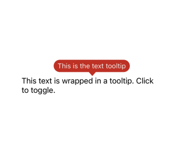
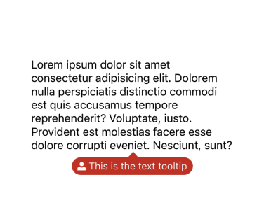
const Example = () => (
<Box flex={1} justifyContent="center" alignItems="center" padding={Spacing.Spacing3}>
<Tooltip text="This is the text tooltip" placement="bottom" startDecorator={({textColor}) => <UserFilled color={textColor} />}>
{toggle => (
<Box mx={Spacing.Spacing1_5}>
<Pressable onPress={toggle}>
<Typography.Body>
Lorem ipsum dolor sit amet consectetur adipisicing elit.
Dolorem nulla perspiciatis distinctio commodi est quis
accusamus tempore reprehenderit? Voluptate, iusto. Provident
est molestias facere esse dolore corrupti eveniet. Nesciunt,
sunt?
</Typography.Body>
</Pressable>
</Box>
)}
</Tooltip>
</Box>
);Result
📜 Tooltip Props
| Prop | Type | Default | Description |
|---|---|---|---|
type | 'primary' | 'secondary' | 'neutral' | 'primary' | Determines the background and text color style. |
size | 'large' | 'medium' | 'small' | 'small' | Sets the font size of the tooltip content. |
text | string | '' | Text content to be displayed inside the tooltip. |
isDefaultVisible | boolean | false | Whether the tooltip is shown by default. |
onHover | () => void | Promise<void> | undefined | Callback executed when the tooltip is toggled (hover/tap). |
startDecorator | (options: { textColor: string, textColorChoice: ColorChoices }) => React.ReactNode | undefined | Optional leading element (e.g. icon or emoji) before the text. |
endDecorator | (options: { textColor: string, textColorChoice: ColorChoices }) => React.ReactNode | undefined | Optional trailing element (e.g. icon) after the text. |
placement | 'top' | 'right' | 'bottom' | 'left' | 'auto' | 'floating' | 'center' | 'auto' | Tooltip position relative to the anchor. Uses react-native-popover-view. |
showTooltipTail | boolean | true | Whether to show the arrow connecting the tooltip to its trigger. |
children | (toggle: () => void) => React.ReactNode | required | A function that receives a toggle handler to control the tooltip manually (usually wraps a trigger). |
TextInput
TextInput component from the UILaunch design system. A customizable input field with support for labels, adornments, error handling, and helper texts.
BottomSheet
A modal bottom sheet component for displaying content in an overlay panel, supporting imperative control, close actions, and optional headers.