TextInput
TextInput component from the UILaunch design system. A customizable input field with support for labels, adornments, error handling, and helper texts.
🧩 TextInput Component
A customizable input field component based on react-native, styled using @shopify/restyle. It supports labels, variants, adornments, error handling, and helper texts.
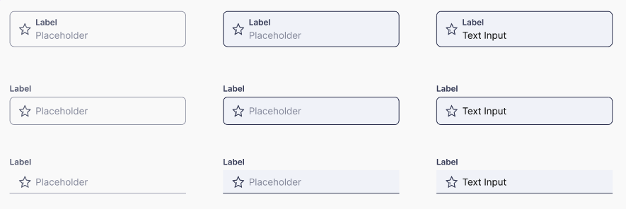
Default state
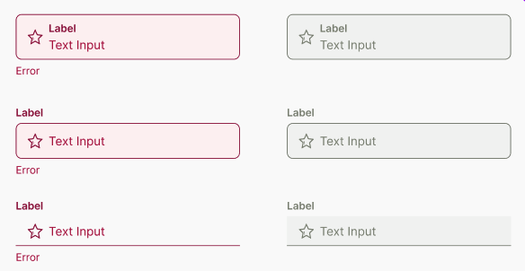
Disabled and Error states
Usage
import Box from '@madefordevs1999/ui-launch-native/system/atoms/Box';
import TextInput, { InputVariantEnum } from '@madefordevs1999/ui-launch-native/system/atoms/TextInput';
import EditFilled from '@madefordevs1999/ui-launch-native/system/icons/informative/EditFilled/EditFilled';
import useTheme from '@madefordevs1999/ui-launch-native/system/theme/useTheme';
const Example: React.FC = () => {
const {colors} = useTheme();
return (
<Box flex={1} justifyContent="center" alignItems="center">
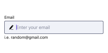
<TextInput
label="Email"
labelPosition="outside"
placeholder="Enter your email"
helperText="Please enter a valid email address"
startAdornment={({ hasError }) => (
<EditFilled
color={hasError ? colors.TextError : colors.TextNeutral}
size={SpacingValues.Spacing2}
/>
)}
inputVariant={InputVariantEnum.Outlined}
/>
</Box>
)
};
export default Example;Results
🎨 Styling Support (via Restyle)
The TextInput component supports styling through the Restyle system, allowing you to customize its appearance using theme tokens. So you can pass additional styling props thanks to the TextInputRestyleProps, such as:
- padding, margin, borderColor, borderWidth
- backgroundColor, fontSize, fontFamily
- Any variant from your custom Restyle theme
🔗 Related Enums
InputVariantEnum
enum InputVariantEnum {
  Outlined = 'outlined',
  Underlined = 'underlined',
}
LabelPositionEnum
enum LabelPositionEnum {
  Inside = 'inside',
  Outside = 'outside',
}
📜 TextInput Props
| Prop Name | Type | Default | Description |
|---|---|---|---|
disabled | boolean | false | If true, the switch cannot be interacted with. |
value | boolean | — | Current value of the switch (controlled). |
initialValue | boolean | false | Initial value for the switch if value is not provided. |
onValueChange | (value: boolean) => void | — | Callback function when the switch is toggled. |
activeText | string | — | Text to display when the switch is active (checked). |
inactiveText | string | — | Text to display when the switch is inactive (unchecked). |