TextInputWithIcons
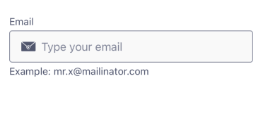
TextInputWithIcons is a flexible text input component that extends the base TextInput by allowing the inclusion of customizable icons at the start and/or end of the input field. These icons can be interactive and adapt their color based on the input state.
✨ Features
- Supports optional icons before and after the text field (startIcon, endIcon)
- Icons dynamically adapt their color based on active and error states
- Icons can be tappable with custom behavior (onPress)
- Fully compatible with the design system's theming and spacing
🧾 TextInputWithIcons Props
| Name | Type | Default | Description |
|---|---|---|---|
startIcon | InputIconOptions | undefined | Optional icon displayed at the start of the input. Can include a tap handler. |
endIcon | InputIconOptions | undefined | Optional icon displayed at the end of the input. Can include a tap handler. |
...rest | TextInputProps (except startAdornment, endAdornment) | — | All other props from the base TextInput component, such as value, placeholder, onChangeText, etc. |
🎨 Theming
- Icon color changes dynamically using the design system:
- Error state: IconErrorStrong
- Active state: IconStrong01
- Default (inactive): IconSubtle
- Icon size uses SpacingValues.Spacing2_5
- Tappable icons use a Pressable with hitSlop=10 for better usability
💡 Usage
import TextInputWithIcons from '@madefordevs1999/ui-launch-native/system/molecules/TextInputWithIcons';
import EmailFilled from '@madefordevs1999/ui-launch-native/system/icons/informative/EmailFilled';
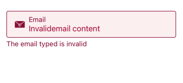
const Example = () => {
const [value, setValue] = useState('Invalidemail content');
const [hasError, setHasError] = useState(true);
const helperText = hasError ? 'The email typed is invalid' : 'i.e. random@gmail.com';
return (
<TextInputWithIcons
hasError
value={value}
onChangeText={setValue}
label="Email"
placeholder="Enter your email"
startIcon={{
IconComponent: EmailFilled,
onPress: () => console.log('Email icon pressed'),
}}
endIcon={{
IconComponent: EmailFilled,
onPress: () => console.log('End icon pressed'),
}}
/>
);
};🖼️ Example Result
🔄 Behavior
- If startIcon or endIcon is provided, the component renders the icon dynamically based on the current input state
- Icons can be static or interactive (with onPress)
- The component maintains full compatibility with the base TextInput API