Category Button
🏷️ CategoryButton
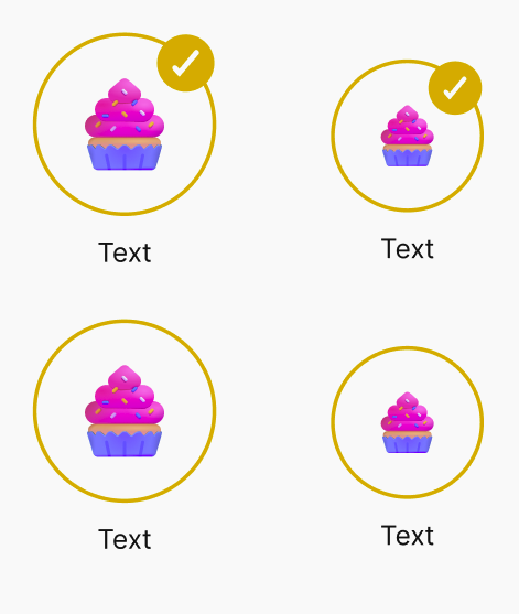
A visual category selector button used to represent and select different options or categories. Displays an icon and label, and indicates selection with a checkmark overlay. Available in two visual variants.
✅ When to use
Use CategoryButton when you want to:
- Present a grid or list of categories with icons.
- Allow users to select or toggle between different types of content.
- Provide a compact visual selector suitable for onboarding, filters, or content segmentation.
🚫 When not to use
Avoid using CategoryButton if:
- You require multi-line text or descriptions inside the button.
- You need to perform complex interactions beyond a simple onSelect toggle.
- The visual icon does not meaningfully represent the category or creates ambiguity.
📦 Import
import CategoryButton from '@madefordevs1999/ui-launch-native/system/templates/CategoryButton';🧩 Usage
import Box from '@madefordevs1999/ui-launch-native/system/atoms/Box';
import Spacing from '@madefordevs1999/ui-launch-native/system/theme/spacing';
import CategoryButton, { CategoryButtonVariants } from '@madefordevs1999/ui-launch-native/system/templates/CategoryButton';
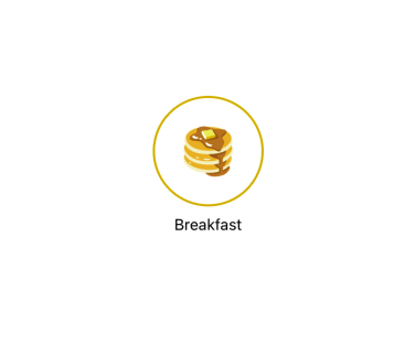
const category = {
id: '1',
name: 'Breakfast',
image: 'https://images.emojiterra.com/google/noto-emoji/unicode-15/color/512px/1f95e.png',
};
const Example = () => (
<Card
sourceCover="https://placehold.co/600x400.png"
content={
<Box p={Spacing.Spacing1_5}>
<Typography.Body marginBottom={Spacing.Spacing1}>
This is a card with some content. You can add more details
here.
</Typography.Body>
<Box justifyContent="flex-end" flexDirection="row">
<ButtonWithIcon
rightIcon={{IconComponent: PlusCircle}}
onPress={() => Alert.alert('Button Pressed')}
text="Read More"
variant="primary"
size={ButtonSizes.Small}
/>
</Box>
</Box>
}
/>
);Result
📜 CategoryButton Props
| Prop | Type | Default | Description |
|---|---|---|---|
category | { id: string; name: string; image: string; } | required | The category information displayed inside the button. |
selected | boolean | false | Indicates if the button is currently selected. Shows a check icon if true. |
variant | 'default' | 'small' | 'default' | Determines icon and checkmark size. |
onSelect | () => void | undefined | Callback when the button is pressed. |
...rest | PressableProps | — | Additional props inherited from Pressable. |