OTPFormScreen
A full-screen form for entering OTP codes with auto-focus and customizable actions, built with the UILaunch design system.
📲 OTPFormScreen Component
The OTPFormScreen component renders a full-screen form for entering one-time passwords (OTP) with support for automatic input focus, action buttons, and contextual messaging. It is an expanded variant of the OTPForm component, designed for screens rather than sheets or modals. It integrates with the OTPInput and OTPForm components from the UILaunch design system.
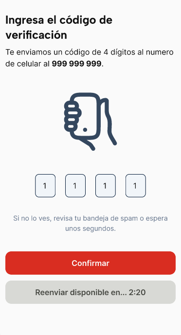
✨ Features
- Full-screen layout for OTP entry
- Automatic focus on mount when
autoFocusistrue - Primary and optional secondary action buttons
- Supports OTP channels such as SMS or Email
- Stylized with
OTPFormVariants.Expandedlayout - Built on top of the
OTPFormbase component
Notes
autoFocusintroduces a 400ms delay before focusing the input to prevent keyboard issues- This component is ideal for onboarding flows, account verification, or 2FA authentication screens
- All props (except
inputRefandvariant) are forwarded toOTPForm
📦 Import
import OTPFormScreen from '@madefordevs1999/ui-launch-native/system/templates/OTPFormScreen';Usage
import OTPFormScreen from '@madefordevs1999/ui-launch-native/system/templates/OTPFormScreen';

const Example = () => {
  return (
    <OTPFormScreen
      autoFocus
      title="Verify Your Identity"
      description="Enter the 6-digit code sent to your email address."
      length={6}
      primaryButton={{
        title: 'Continue',
        onPress: () => console.log('Continue pressed'),
      }}
      secondaryButton={{
        title: 'Resend Code',
        onPress: () => console.log('Resend code'),
      }}
      channel="email"
    />
  );
};

export default Example;
📜 OTPFormScreen Props
| Prop | Type | Default | Description |
|---|---|---|---|
autoFocus | boolean | false | If true, auto-focuses the OTP input on mount |
title | string | required | Title displayed above the OTP input |
description | string | required | Description text displayed below the title |
length | number | 4 | Number of digits expected for the OTP code |
primaryButton | { title: string; onPress?: () => void; disabled?: boolean } | required | Main action button configuration |
secondaryButton | { title: string; onPress?: () => void; disabled?: boolean } | — | Optional secondary action (e.g., "Resend") |
channel | 'sms' | 'email' | — | OTP delivery channel (used for visual and contextual differentiation) |
onFillComplete | () => void | Promise<void> | — | Callback when the user finishes entering all OTP digits |