PlaceCard
A visual card component for showcasing place information like name, address, rating, walking time, and distance.
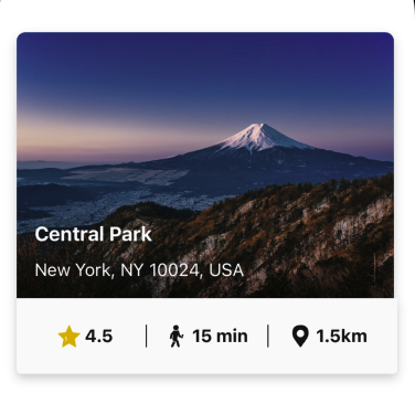
🏞️ PlaceCard Component
The PlaceCard component presents visual and textual details about a place, including an image, name, address, and metrics like rating, walking time, and distance. It is built using React Native and styled with the UILaunch design system.
✨ Features
- Supports two size modes: small and base
- Displays cover image with rounded top corners
- Shows name and address over a translucent background overlay
- Renders icons and metrics (rating, walking time, and distance)
- Customizable using the Card component base
- Themed using useTheme for color consistency
Notes
- This component is designed to be used with the UILaunch design system and assumes the presence of themed components like Box, Typography, and Card.
- Cover images must be passed via the placeInfo.cover property and will be rendered as a full-background image.
- It is recommended to wrap the component in containers that control layout and spacing according to your app’s needs.
📦 Import
import PlaceCard, { /** types and enums */ } from '@madefordevs1999/ui-launch-native/system/organisms/PlaceCard';🧩 Usage
import Box from '@madefordevs1999/ui-launch-native/system/atoms/Box';
import PlaceCard from '@madefordevs1999/ui-launch-native/system/templates/PlaceCard';
import Spacing from '@madefordevs1999/ui-launch-native/system/theme/spacing';
const Example = () => (
<Box flex={1} padding={Spacing.Spacing3} justifyContent="center" alignItems="center">
<PlaceCard
size="base"
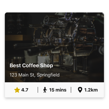
placeInfo={{
cover: 'https://pixabay.com/get/g3c63e82e25774e65864134349fb19b67d5b3105a12258704aae51e881734eaa59ee8eae2b311d5abfaf0292cdf234e423d0e2bbc2d0f5d16fc910920ded6ed702599037bcbf6753ad24e5b6342648d1b_640.jpg',
name: 'Best Coffee Shop',
address: '123 Main St, Springfield',
rate: 4.7,
walkingTime: '15 mins',
distanceInKm: 1.2,
}}
/>
</Box>
);
export default Example;📸 Results
📜 PlaceCard Props
| Prop | Type | Default | Description |
|---|---|---|---|
size | 'small' | 'base' | 'small' | Controls the layout size of the card |
placeInfo | { cover: string; name: string; address: string; rate: number; walkingTime: string; distanceInKm: number } | required | Object containing all place-related data |
...rest | Omit<CardProps, 'renderCover' | 'content' | 'sourceCover'> | - | Additional props passed down to the underlying Card |