OTPFormSheet
A bottom sheet form component for entering OTP codes with automatic focus, optional buttons, and support for SMS or Email channels.
🔐 OTPFormSheet Component
The OTPFormSheet component displays a verification form inside a bottom sheet. It provides a compact interface for entering one-time passwords (OTP) via SMS or email. The component supports automatic focus, a customizable title, description, action buttons, and integrates with the OTPForm and OTPInput components from the UILaunch design system.
✨ Features
- Renders inside a bottom sheet with optional backdrop and pan-to-close
- Automatically focuses the OTP input when the sheet becomes active
- Supports primary and secondary action buttons
- Accepts a customizable title, description, and number of OTP digits
- Supports input via SMS or Email channels
- Built using
BottomSheet,OTPForm, andOTPInputfrom UILaunch
Notes
focusOnAppearenables delayed input focus when the sheet is opened- The component uses
OTPFormVariants.Compactby default - The OTP input is auto-focused after a small delay (480ms) to avoid keyboard glitches
📦 Import
import OTPFormSheet from '@madefordevs1999/ui-launch-native/system/templates/OTPFormSheet';Usage
import OTPFormSheet, { OTPChannels } from '@madefordevs1999/ui-launch-native/system/templates/OTPFormSheet';
import { useState } from 'react';
const Example = () => {
const [visible, setVisible] = useState(true);
return (
<OTPFormSheet
isActive={visible}
focusOnAppear
onClose={() => setVisible(false)}
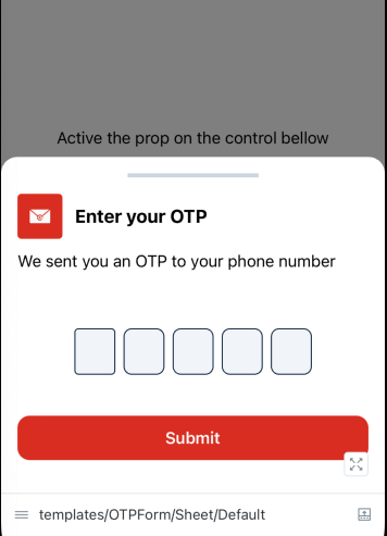
title="Enter your OTP"
channel={OTPChannels.Email}
description="We sent you an OTP to your phone number."
length={5}
primaryButton={{
onPress: () => {},
title: 'Submit',
}}
/>
);
};
export default Example;📸 Result
📜 OTPFormSheet Props
| Prop | Type | Default | Description |
|---|---|---|---|
isActive | boolean | required | Controls visibility of the bottom sheet |
onClose | () => void | Promise<void> | — | Callback triggered when the sheet is dismissed |
focusOnAppear | boolean | false | If true, the OTP input will auto-focus when the sheet appears |
title | string | required | The title displayed above the OTP input |
description | string | required | The description text displayed below the title |
length | number | 4 | Number of digits expected for the OTP input |
primaryButton | { title: string; onPress?: () => void; disabled?: boolean } | required | Main action button configuration |
secondaryButton | { title: string; onPress?: () => void; disabled?: boolean } | — | Optional secondary action (e.g., "Resend code") |
channel | 'sms' | 'email' | — | OTP delivery channel (used for context in UI, e.g., icons or messages) |
onFillComplete | () => void | Promise<void> | — | Called when the user completes input of all OTP digits |
enableBackdropTapToClose | boolean | true | Allows tapping the backdrop to close the sheet |
enablePanDownToClose | boolean | true | Allows swiping down to dismiss the sheet |