BottomSheet
A modal bottom sheet component for displaying content in an overlay panel, supporting imperative control, close actions, and optional headers.
📥 BottomSheet Component
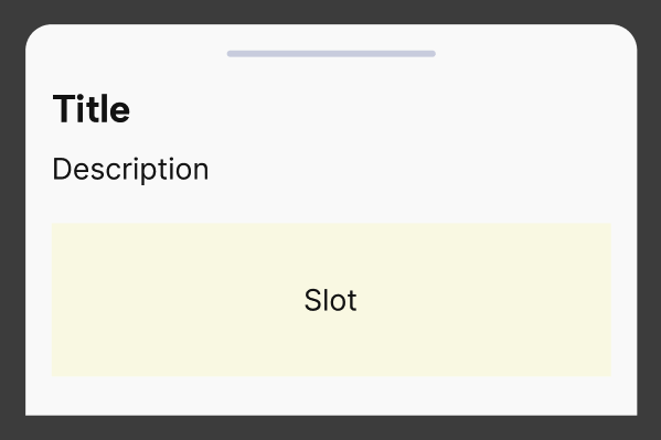
The BottomSheet component renders a swipeable, modal overlay from the bottom of the screen. It is ideal for displaying supplemental content like forms, filters, actions, or confirmations. Built on top of @gorhom/bottom-sheet, it includes a custom layout with optional title, description, and close button. It supports both declarative (isActive) and imperative (ref) control for full flexibility.
✨ Features
- Custom header with optional title, description, and close button
- Declarative
isActiveprop or imperative control via ref methods (open,close,snapTo) - Styled handle and rounded top corners
- Supports tap-to-close and pan-down-to-close interactions
- Built with the UILaunch design system (
Box,Typography,Spacing, etc.)
Notes
BottomSheetwraps the internalBaseBottomSheet, applying UI conventions from the design system- When
isActiveis true, the sheet opens to the first snap point - The
onClosecallback fires when the user closes the sheet or presses the close button - Content is injected via
children, and layout is vertically scrollable by default
📦 Import
import BottomSheet from '@madefordevs1999/ui-launch-native/system/molecules/BottomSheet';🧩 Usage
import React, { useRef } from 'react';
import BottomSheet, { BottomSheetMethods } from '@madefordevs1999/ui-launch-native/system/molecules/BottomSheet';
import Box from '@madefordevs1999/ui-launch-native/system/atoms/Box';
import Typography from '@madefordevs1999/ui-launch-native/system/atoms/Typography';
import Button from '@madefordevs1999/ui-launch-native/system/atoms/Button';
const Example = () => {
const bottomSheetRef = useRef<BottomSheetMethods>(null);
return (
<Box flex={1} justifyContent="center" alignItems="center">
<Button title="Open Bottom Sheet" onPress={() => bottomSheetRef.current?.open()} />
<BottomSheet
ref={bottomSheetRef}
onClose={() => console.log('Closed')}
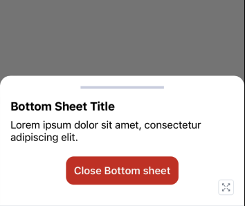
title="Bottom Sheet Title"
description="Lorem ipsum dolor sit amet, consectetur adipiscing elit."
>
<Box flex={1} justifyContent="center" alignItems="center">
<Button
text="Close Bottom sheet"
onPress={() => {
bottomSheetRef.current?.close();
}}
/>
</Box>
</BottomSheet>
</Box>
);
};
export default Example;📸 Result
📜 BottomSheet Props
| Prop | Type | Default | Description |
|---|---|---|---|
isActive | boolean | false | Controls the visibility of the sheet declaratively |
onClose | () => void | — | Callback fired when the sheet is closed |
title | string | '' | Optional title displayed at the top of the sheet |
description | string | '' | Optional description below the title |
enableBackdropTapToClose | boolean | true | Allows tapping on the backdrop to close the sheet |
...rest | BottomSheetProps from @gorhom/bottom-sheet | — | All props from the original @gorhom/bottom-sheet are supported |
🧰 Methods via Ref (BottomSheetMethods)
| Method | Parameters | Description |
|---|---|---|
open() | () | Opens the sheet to the first or second snap point |
close() | () | Closes the sheet |
snapTo() | (index: number) | Snaps to a specific index in the snapPoints array |