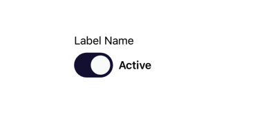
Switch with Label
SwitchWithLabel is a wrapper around the base Switch component that optionally displays a textual label above the switch. It is useful for settings, preferences, or form toggles where a clear label is required.
✨ Features
- Inherits all props from the Switch component
- Adds optional support for a label rendered above the switch
- Uses consistent spacing and typography from the design system
- Suitable for forms, settings screens, and feature toggles
🧾 Props
| Name | Type | Default | Description |
|---|---|---|---|
labelName | string | undefined | Optional text displayed above the switch. |
| ...rest | SwitchProps | — | All other props from the underlying Switch component (e.g., value, onValueChange). |
🎨 Theming
- Typography.Body is used for the label text
- Label and switch are spaced using the Spacing1 token from the design system
💡 Usage
import SwitchWithLabel from '@madefordevs1999/ui-launch-native/system/molecules/SwitchWithLabel';
import { useState } from 'react';
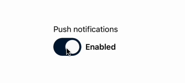
const Example = () => {
const [notificationsEnabled, setNotificationsEnabled] = useState(false);
return (
<SwitchWithLabel
labelName="Push notifications"
activeText="Enabled"
inactiveText="Disabled"
value={notificationsEnabled}
onValueChange={setNotificationsEnabled}
/>
);
};
export default Example;🔄 Usage Result
🔄 Behavior
- If labelName is provided, it appears above the switch
- If labelName is omitted, only the switch is rendered
- The switch maintains full interactive behavior via SwitchProps