Card
🃏 Card
A customizable visual container used to display content with an optional image cover and content area. Supports shadow, border radius, and custom cover rendering.
✅ When to use
Use Card when you want to:
- Display summarized or preview content such as news, promotions, or user info.
- Use image covers with overlay or accompanying text.
- Maintain consistent spacing, shadow, and radius in card-based UI designs.
🚫 When not to use
Avoid using Card if:
- You require full-width interactive areas without shadow or rounded corners.
- Your use case involves complex nested scrolls or gestures inside the card.
- The content does not need to be visually separated or highlighted.
📦 Import
import Card from '@madefordevs1999/ui-launch-native/system/molecules/Card';🧩 Usage
import Box from '@madefordevs1999/ui-launch-native/system/atoms/Box';
import { ButtonSizes } from '@madefordevs1999/ui-launch-native/system/atoms/Button';
import Typography from '@madefordevs1999/ui-launch-native/system/atoms/Typography';
import ButtonWithIcon from '@madefordevs1999/ui-launch-native/system/molecules/ButtonWithIcon';
import Card from '@madefordevs1999/ui-launch-native/system/molecules/Card';
import Spacing from '@madefordevs1999/ui-launch-native/system/theme/spacing';
import PlusCircle from '@madefordevs1999/ui-launch-native/system/icons/functional/PlusCircle';
const Example = () => (
<Box
flex={1}
justifyContent="center"
alignItems="center"
padding={Spacing.Spacing4}>
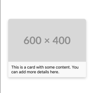
<Card
sourceCover="https://placehold.co/600x400.png"
content={
<Box p={Spacing.Spacing1_5}>
<Typography.Body marginBottom={Spacing.Spacing1}>
This is a card with some content. You can add more details
here.
</Typography.Body>
</Box>
}
/>
</Box>
);Result
Card Props
| Prop | Type | Default | Description |
|---|---|---|---|
sourceCover | string | required | URL of the image to be used as the card cover. |
renderCover | (source: string) => ReactNode | undefined | Optional custom renderer for the card's image cover. |
content | ReactNode | required | The content displayed inside the card body (below the cover). |
...rest | PressableProps | — | Additional props inherited from Pressable, such as onPress, style, etc. |