Button with Icon
📌 ButtonWithIcon
A flexible button component that supports adding icons to the left, right, or both sides of the button label. It builds on top of the base Button and dynamically adjusts icon size and color based on the button’s styling context.
✅ When to use
Use ButtonWithIcon when you want to:
- Visually reinforce an action with a meaningful icon.
- Align with a design system that calls for icon-enhanced buttons.
- Indicate direction or intent (e.g. "Next", "Back", "Download") clearly with iconography.
🚫 When not to use
Avoid using ButtonWithIcon if:
- The icon is purely decorative and adds no semantic value.
- You need full control over icon positioning outside of standard left/right placements.
- You're creating icon-only buttons (use an Icon component instead).
Import
import ButtonWithIcon from '@madefordevs1999/ui-launch-native/system/molecules/ButtonWithIcon'; 🧩 Usage
import Box from '@madefordevs1999/ui-launch-native/system/atoms/Box';
import PlusFilled from '@madefordevs1999/ui-launch-native/system/icons/functional/PlusFilled';
import ButtonWithIcon from '@madefordevs1999/ui-launch-native/system/molecules/ButtonWithIcon';
import Spacing from '@madefordevs1999/ui-launch-native/system/theme/spacing';
import { Alert } from 'react-native';
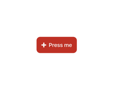
const Example = () => (
<Box
flex={1}
justifyContent="center"
alignItems="center"
padding={Spacing.Spacing4}>
<ButtonWithIcon
size="large"
text="Press me"
onPress={() => Alert.alert('Button Pressed')}
leftIcon={{
IconComponent: PlusFilled,
}}
/>
</Box>
); Result
📜 ButtonWithIcon Props
| Prop | Type | Default | Description |
|---|---|---|---|
leftIcon | Omit<IconOptions, 'color' | 'size'> | undefined | Icon rendered on the left side of the button text. |
rightIcon | Omit<IconOptions, 'color' | 'size'> | undefined | Icon rendered on the right side of the button text. |
...rest | ButtonProps | – | Inherits all props from the base Button component. |