Selector
🧲 Selector
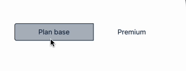
A flexible component that lets users select one item from a group, typically used for filters, categories, or toggle-like selections. Items are visually styled to reflect their selected state and grouped together in a horizontal or vertical layout.
✅ When to use
Use the Selector component when you need:
- A segmented control or filter switcher UI.
- To allow only one selectable option at a time from a visual group.
- Horizontal or vertical arrangement of interactive buttons.
🚫 When not to use
Avoid Selector if:
- You need multiple selections (use checkboxes instead).
- You want a dropdown menu (use Select or Dropdown components).
- You want to display options as tabs (consider a Tabs component).
Note
- Do not use SelectorGroup inside of Box with
justifyContentoralignItemsproperties, as it will not work properly.
📦 Import
import SelectorItem, { SelectorGroup } from '@madefordevs1999/ui-launch-native/system/molecules/Selector';🧩 Usage
import SelectorItem, { SelectorGroup, SelectorGroupDirection } from '@madefordevs1999/ui-launch-native/system/molecules/Selector';
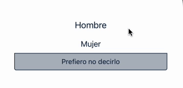
const Example = () => {
const [selectedOption, setSelectedOption] = useState('Hombre');
const handleChange = (value: string) => {
setSelectedOption(value);
};
return (
<SelectorGroup
direction={SelectorGroupDirection.VERTICAL}
onChange={handleChange}
value={selectedOption}>
<SelectorItem label="Hombre" size="large" />
<SelectorItem label="Mujer" size="medium" />
<SelectorItem label="Prefiero no decirlo" />
</SelectorGroup>
)
};Result