RangeSlider
A range slider component for selecting a range of values.
📦 RangeSlider Component
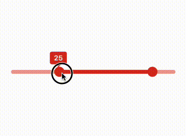
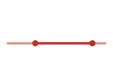
The RangeSlider component allows users to select a numeric range by dragging two knobs on a horizontal rail. It's built using React Native with animated gestures via react-native-reanimated and react-native-gesture-handler.
✨ Features
- Supports custom min/max values
- Configurable step increments
- Displays animated tooltips for start and end values
- Prevents overlapping knobs via configurable spacing
- Animated fill bar showing the selected range
- Fires an onValueChange callback with updated values on knob release
Notes
- This component needs to be used inside a Box component to ensure proper layout and styling. It is designed to work seamlessly with the UILaunch design system. We recommend using it within a Box to maintain consistent spacing and alignment.
- The component needs to be used within a GestureHandlerRootView to ensure proper gesture handling. This is required for the component to function correctly, especially on Android devices. Before using the RangeSlider, ensure that your app's root component is wrapped in
GestureHandlerRootViewfromreact-native-gesture-handler.
🧩 Usage
import Box from '@madefordevs1999/ui-launch-native/system/atoms/Box';
import RangeSlider from '@madefordevs1999/ui-launch-native/system/atoms/RangeSlider';

const Example = () => {
  const [startValue, setStartValue] = useState(20);
  const [endValue, setEndValue] = useState(80);

  return (
    <Box width="100%" padding={Spacing.Spacing3}>
      <RangeSlider
        minValue={0}
        maxValue={100}
        step={5}
        initialStartValue={20}
        initialEndValue={80}
        onValueChange={(start, end) => {
          console.log(`Range selected: ${start} to ${end}`);
        }}
      />
    </Box>
  );
};

export default Example;
📸 Results
📜 RangeSlider Props
| Prop | Type | Default | Description |
|---|---|---|---|
minValue | number | 0 | Minimum value allowed |
maxValue | number | 10 | Maximum value allowed |
initialStartValue | number | minValue | Initial position of the left knob |
initialEndValue | number | maxValue | Initial position of the right knob |
step | number | 2 | Step increment for slider values |
onValueChange | (start: number, end: number) => void | Promise<void> | () => {} | Callback fired when either knob is released |