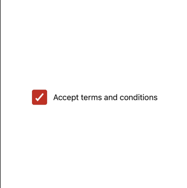
Checkbox With Label
☑️ CheckboxWithLabel
A horizontal checkbox component that pairs a label with a checkbox, providing a clean and accessible way to display binary options in forms or settings.
✅ When to use
Use CheckboxWithLabel when you want to:
- Offer a simple yes/no or on/off option with a description.
- Use checkboxes inside forms or preference screens with clearly labeled meanings.
- Improve readability by aligning the label directly next to the checkbox.
🚫 When not to use
Avoid using CheckboxWithLabel if:
- You require multiline or richly formatted labels.
- You need to display the checkbox below or above the label.
- The label should contain interactive elements or nested components.
📦 Import
import CheckboxWithLabel from '@madefordevs1999/ui-launch-native/system/molecules/CheckboxWithLabel';🧩 Usage
import CheckboxWithLabel from '@madefordevs1999/ui-launch-native/system/molecules/CheckboxWithLabel';
import { useState } from 'react';
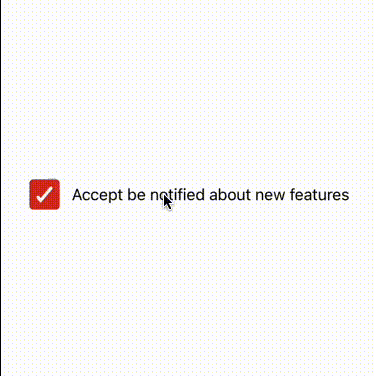
const Example = () => {
const [acceptSubscription, setAcceptSubscription] = useState(false);
return (
<CheckboxWithLabel
label="Accept be notified about new features"
value={acceptSubscription}
onValueChange={checked => setAcceptSubscription(checked)}
/>
)
};
export default Example;Result
📜 CheckboxWithLabel Props
| Prop | Type | Default | Description |
|---|---|---|---|
label | string | undefined | The label text displayed to the right of the checkbox. |
value | boolean | false | Determines whether the checkbox is selected. |
onValueChange | (value: boolean) => void | undefined | Callback when the checkbox state changes. |
disabled | boolean | false | Disables interaction if set to true. |
...rest | CheckboxProps (excluding children) | — | Any additional props from the base Checkbox component. |