ButtonSubmit
ButtonSubmit
ButtonSubmit is a wrapper around the ButtonWithIcon component that simplifies usage in form submission or asynchronous operations. It adds built-in loading state handling and disables the button automatically when loading, depending on configuration.
✨ Features
- Inherits all props from ButtonWithIcon
- Adds support for a loading spinner via isLoading
- Automatically disables the button when loading (configurable)
- Preserves button variants and style theming
🧾 ButtonSubmit Props
| Name | Type | Default | Description |
|---|---|---|---|
isLoading | boolean | false | Displays a loading spinner on the button and conditionally disables it. |
disabledWhenIsLoading | boolean | true | When true, the button will be disabled while isLoading is true. |
disabled | boolean | false | Manually disables the button. Overrides interaction. |
| ...rest | ButtonWithIconProps | — | All other props from the underlying ButtonWithIcon component. |
🎨 Theming
The component uses useTheme() to access color tokens. The loading spinner color adapts based on:
- Whether the button is disabled during loading
- The variant of the button (e.g., Primary shows a white spinner)
💡 Usage
import ButtonSubmit from '@madefordevs1999/ui-launch-native/system/molecules/ButtonSubmit';
import MarkFilled from '@madefordevs1999/ui-launch-native/system/icons/informative/MarkFilled';
import { useState } from 'react';
const Example = () => {
const [isSubmitting, setIsSubmitting] = useState(false);
const handleSubmit = async () => {
setIsSubmitting(true);
try {
// Simulate an async operation
await new Promise(resolve => setTimeout(resolve, 2000));
} finally {
setIsSubmitting(false);
}
};
return (
<ButtonSubmit
isLoading={isSubmitting}
disabledWhenIsLoading={true}
title="Save preferences"
rightIcon={{IconComponent: MarkFilled}}
onPress={handleSubmit}
/>
);
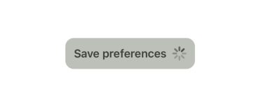
};🖼️ Example Result

🔄 Behavior
When isLoading is true:
- A spinner is shown on the right side (renderRight)
- If disabledWhenIsLoading is true, the button becomes disabled
- The spinner color adapts to the button style and state