Snackbar
🟨 Snackbar
A transient notification component used to inform users about a process that has been completed, a warning, or an error. It supports various styles (solid, outlined) and statuses (default, danger, success, caution), and it can auto-dismiss after a set duration.
✅ When to use
Use Snackbar when you want to:
- Display short, contextual messages about user actions.
- Communicate system feedback such as success, error, or warning messages.
- Temporarily notify the user without blocking their interaction.
🚫 When not to use
Avoid using Snackbar if:
- The message contains critical information that must not be missed.
- You require user input (use a modal or dialog instead).
- You need to show multiple notifications at the same time (consider a toast stack or notification center).
⚙️ Snackbar Props
| Prop | Type | Default | Description |
|---|---|---|---|
message | string | Required | The main text message displayed in the snackbar. |
title | string | undefined | Optional title displayed above the message. |
status | 'default' | 'danger' | 'success' | 'caution' | 'default' | Defines the tone of the snackbar. |
variant | 'solid' | 'outlined' | 'solid' | Visual style of the snackbar. |
startIcon | Omit<IconOptions, 'color'> | undefined | Optional icon displayed at the start of the snackbar. |
closeButton | boolean | false | Whether to show a close button. |
onClose | () => void | Promise<void> | undefined | Callback fired when the snackbar closes. |
autoClose | boolean | false | If true, the snackbar will auto-dismiss. |
autoCloseTime | number | 2000 | Duration in milliseconds before auto-dismiss. |
animatedPresence | boolean | false | Whether to animate the appearance and disappearance of the snackbar. |
🧪 Example
import Snackbar from '@madefordevs1999/ui-launch-native/system/molecules/Snackbar';

const Example = () => {
  return (
    <Snackbar
      title="Success!"
      message="Your changes have been saved."
      status="success"
      variant="outlined"
      closeButton
      autoClose
      animatedPresence
      autoCloseTime={3000}
    />
  )
};
🖌️ Example result

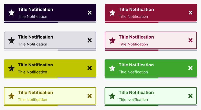
🎨 Visual variants
| Variant | Description |
|---|---|
solid | Filled background with contrasting text and icon. |
outlined | Subtle background with colored border and strong icon/text. |
🟢 Status options
| Status | Color Scheme | Usage |
|---|---|---|
default | Neutral | Generic information or neutral context. |
danger | Red tones | Destructive or error messages. |
success | Green tones | Confirmation or success feedback. |
caution | Yellow/Orange tones | Warnings or potentially risky actions. |
🎬 Animation
When animatedPresence is enabled:
- The snackbar slides and fades in.
- The autoClose duration is animated with a progress bar.
- On dismissal, it fades and slides out.
🛑 Accessibility
- Always pair important messages with accessible alternatives if critical.
- Consider using ARIA live regions if Snackbar is used as a system message.